During fall 2022, I took the class Web Design for my masters program at MCAD. For the course project, I chose to redesign eBay for for a younger audience- 18 to 25 year olds. I chose young adults because eBay largely does not appeal to them, even though buying and selling secondhand goods are popular activities among that age group. The expected user for eBay currently is over the age of 25. Sites such as depop and grailed provide similar services to eBay, however they are more popular among 18-25 year olds than eBay. There are major differences between eBay and these websites in the visual designs and user experience. In order to redesign eBay to appeal to young adults, I wanted to create a design that is trendy, un-cluttered, and easy to use.
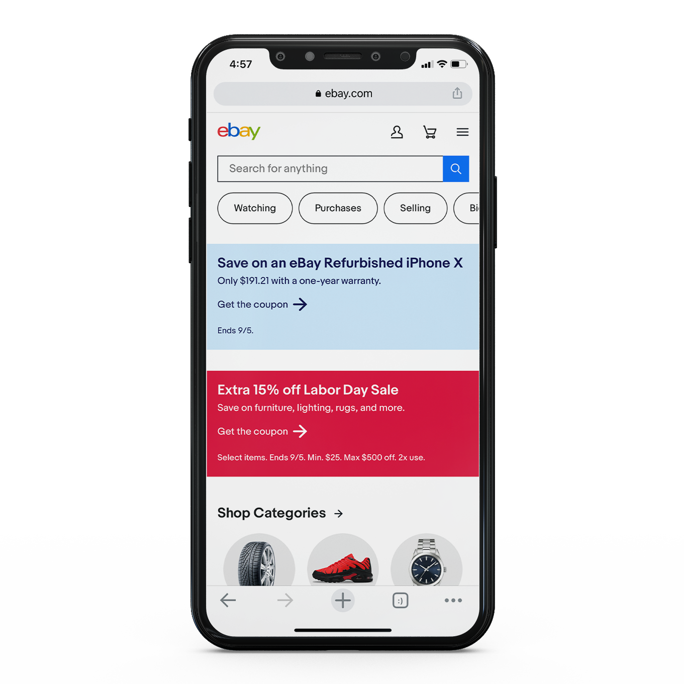
before / after mobile versions
First, I conducted a SWOT analysis and investigated the user journey for an existing user persona. I used my grandfather Fred, who is an active user of eBay, as inspiration. Then, I defined the new intended audience: 18 to 25 year old young adults and created user personas for that new group.
Existing User Persona: Fred
Fred is a 81 year old retired doctor who lives in a townhouse with his wife of 68 years. His most frequently used websites are yahoo mail, ebay, and facebook. Fred spends his free time building a model railroad and playing solitaire on the computer. He enjoys watching crime dramas, reading the Sunday “funnies,” and spending time with his grandkids. He also collects hot wheels cars.
New User Persona: Skyler
Skyler is a 19 year old high schooler who likes playing tennis, using public transportation, and scrolling tiktok for fashion inspiration. They collect vintage denim, play board games with friends, and work at a movie theater. They use depop.com and grailed.com to buy secondhand clothes online.
I explored the possible visuals of the redesign and created two different mood boards. After feedback from classmates, I went with the one with more playful and vintage elements.
mood board
Designing mobile first, I sketched wireframes before tackling the design concepts and layouts for two different user flows. Those steps were repeated for desktop and tablet versions. I aimed to make the layout easy to navigate, got rid of extra links, and prioritized important elements, such as logging in.
mobile wireframes
I also created a brand design system (for the desktop version), which define the design choices such as typography, components, color palette, logo, imagery, and iconography. All work was designed and presented in Figma. All the components came together to make a website that is essentially ebay and also something new.
To appeal to younger users, I designed the interface to be easy to navigate and aimed to make visuals that are stylish, friendly, and youthful. The users should enjoy navigating through the pages and not have to spend much time doing so. This version of eBay has a navigation that is de-cluttered and includes only the salient links.
flow 1: log in (optional: view my profile)
flow 2: choose wallace & gromit shirt (after log in) and buy from cart
mobile prototype
desktop prototype
tablet prototype

