With all the menstrual products in the marketplace, many brands still use gender exclusive language and visuals, such as colors and words that exclude trans men and others under the gender diverse umbrella. For this project, I designed a brand identity including logo, packaging, and manual for gender inclusive menstrual products (tampons).
To execute a visual identity that is successfully gender inclusive, I needed to consider all the elements of design that could imply gender such as color, typography, and imagery. The brand is named Mond, which is German for moon, to emphasize menstruation as a natural cycle.
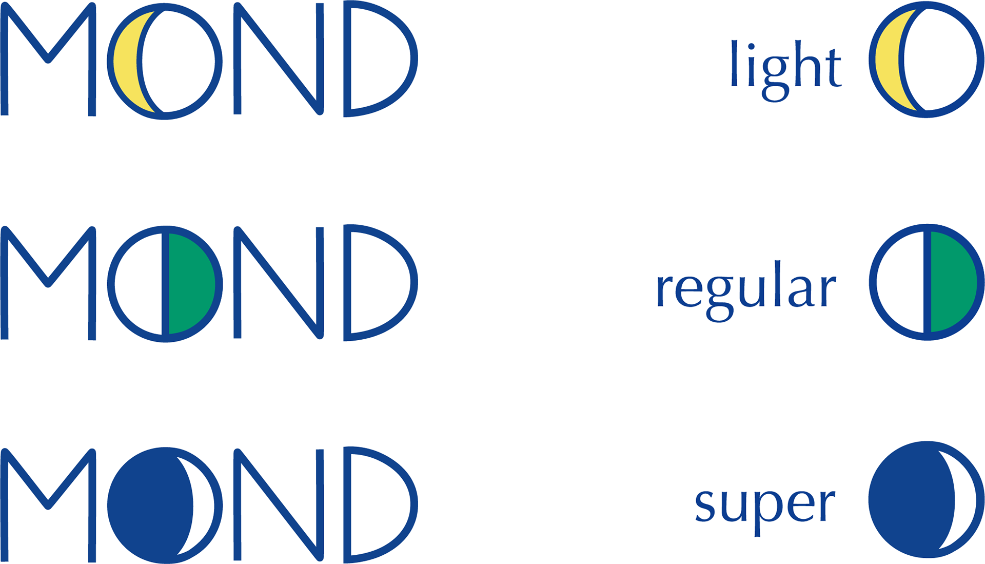
To differentiate between tampon sizes, Mond uses color and phases of the moon imagery.
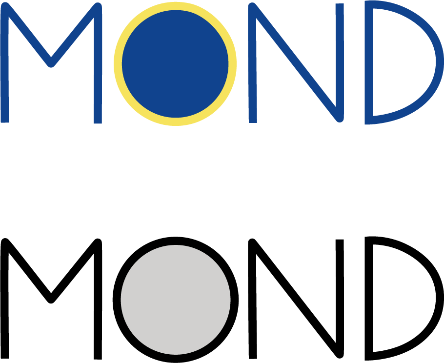
If the logo changes within the size, what is the primary logo? Used for materials such as the instruction manual, the primary logo has a yellow ring around a blue "o" to represent a solar eclipse.
The black and white version of the logo uses gray in the "o" to represent the moon.

yellow = #f6e35d
green = #01996b
blue = #10438e
white = #f5f7ff
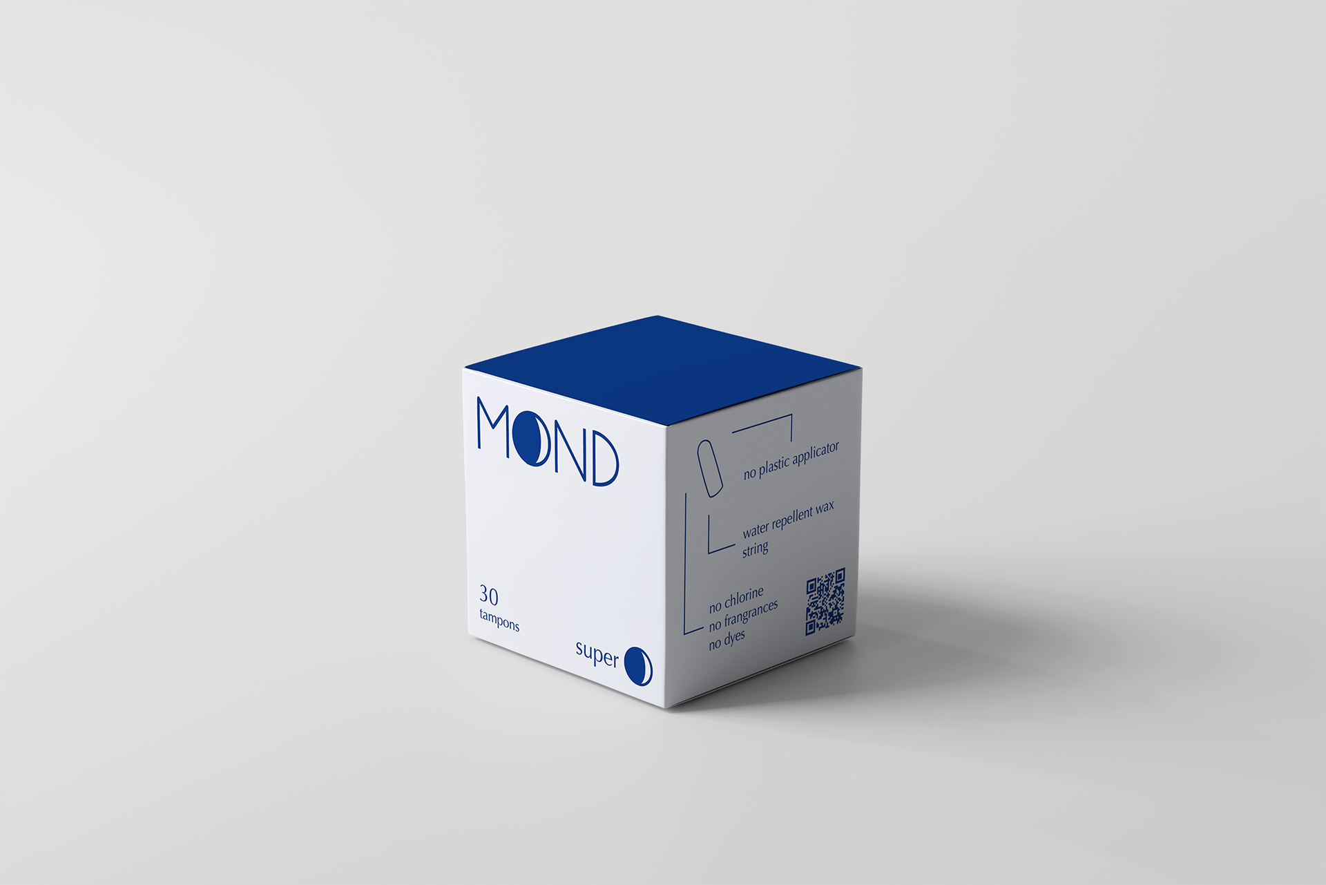
packaging design for sizes regular and super

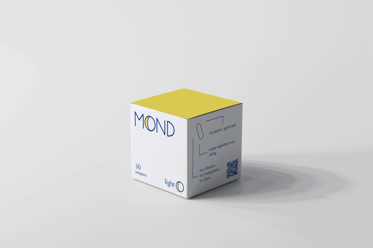
gif of size light packaging
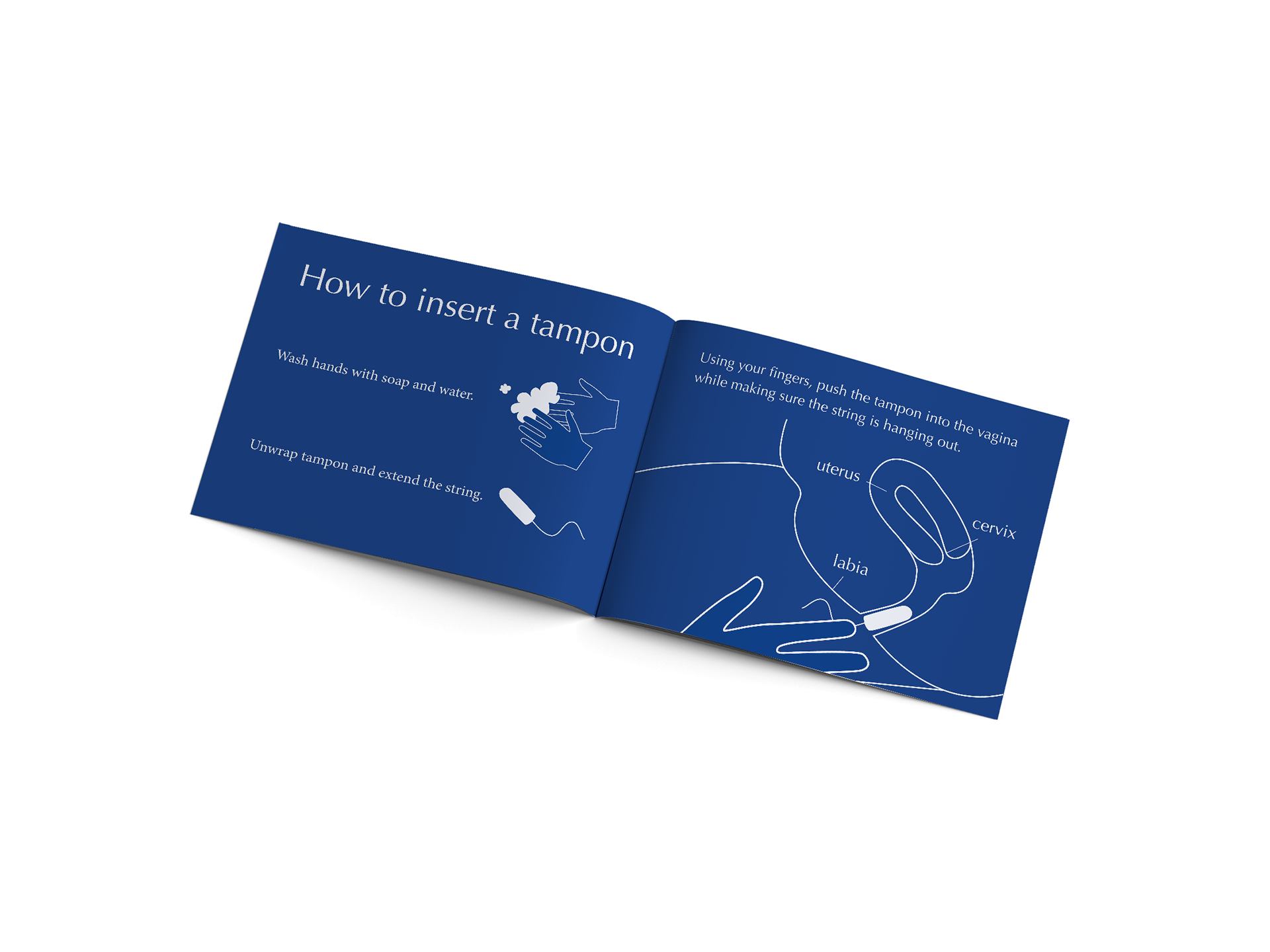
Instruction manual for how to insert tampon